
29 August 2015
Geometric Space Poster
I was over looking at the SpoonGraphics blog again recently and saw a great tutorial about How to Create Abstract Geometric Photo Collage Art .
The design style was something I'd seen around before and always wondered how to create it. I won't take you through the steps for this technique here, as Chris @ SpoonGraphics has already done a great job on that. Instead I will tell you some of the steps I went through to create my version of the design.
My Method
The Geometry
To start with I created the geometric pattern. I tried coming up with a few design ideas myself, but wasn't really happy with any of them so in the end stuck to the tutorial's geometric pattern.
The Background Image
With the geometry created, I then needed to pick a cool image to mix about in the pattern. I used one of my favourite sites for this - Unsplash.com (which is the site Chris links to too on his tutorial). I'm browsing through Unsplash every week or two and usually end up downloading something new as a desktop background.
As the blog is called The Astronaut, I figured I would find a space themed image to use. I did a search for "Space" and came up with this image:
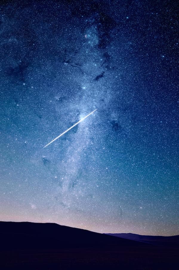
This looked like it was going to be a pretty good image to use. Although there wasn't a big change in textures like in the tutorial's example of the mountains, there is a good range of colour and brightness from the horizon to the top of the frame, so I decided to go ahead with this.
Adding Symmetry
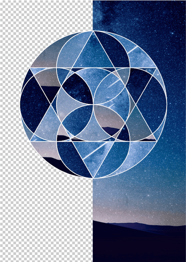
Once I had filled in the geometric shape with different parts of the image, I decided to change the background so that it was symmetrical. The geometric shapes have symmetry so I thought it would work well if the background was symmetrical too.
I masked the image down the middle, masking out the left hand side, so that I still had some detail in the hills on the horizon of the image - the darker hills in the foreground and the lighter hills in the background.
 The background layer is masked down the middle so that only the right hand side is visible
I then duplicated the masked layer and flipped it so that the image was mirrored, creating the symmetry.
Adding the Star Trails
This is one addition to the design that I worked out just play playing about and I'm pretty impressed with how it turned out.
I wanted to add star trails to the image to make it look like the image had been shot with a long exposure.
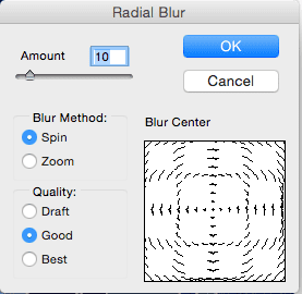
To do this I duplicated the two halves of the background layer and merged them into one full layer and called it Star Spin. I then added a Radial Blur. I played about with the settings and found that a blur amount of 10 with the Spin blur method worked best. I also tweaked the Blur Centre so that the centre matched the centre of the geometric design. The interface for moving the Blur Centre isn't very good for accurate adjustments, so this took a bit of trial and error.
Once I had applied the Radial Blur, I thought that it was a bit too blurred - the mountains were blurred, which wouldn't have been the case if this was a long-exposure shot, and I wanted to get some of the detail back in the stars.
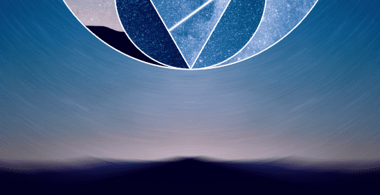 Background blurred with Radial Blur - Note the horizon is pretty blurred
To add back the detail of the stars, I changed the blending mode of the Star Spin layer to Lighten, which kept some of the bright star blurs but mixed in with the detail of the original layer background layer. This created something I was much happier with.
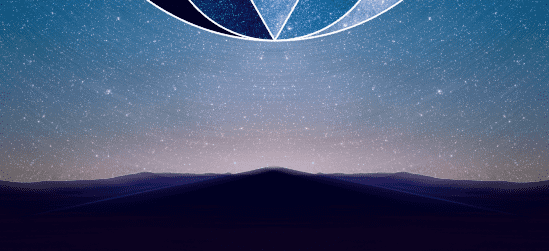 With the blurred layer set to lighten, it brings back the horizon and stars detail - creating a more subtle star trail effect
Finishing Things Off
Once I had the design I was happy with, I made some final adjustments to the image.
To start with I created an adjustment layer over the top. I added a Warming Photo Filter to bring out the oranges of the horizon to contrast with the blues of the sky, and added a Vibrance adjustment to bring out the colours a bit more.
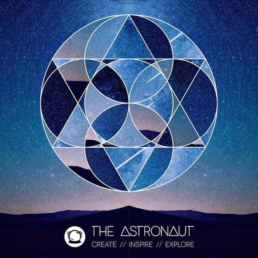
I then pasted in the site's logo, site name and tagline from a file I have in Illustrator and positioned them as required, and with that the design was finished.
Mocking It Up
One final step I did was take the image into a Poster Mockup Photoshop file I had downloaded a while back to see what it would look like as a poster, and here's the final result.
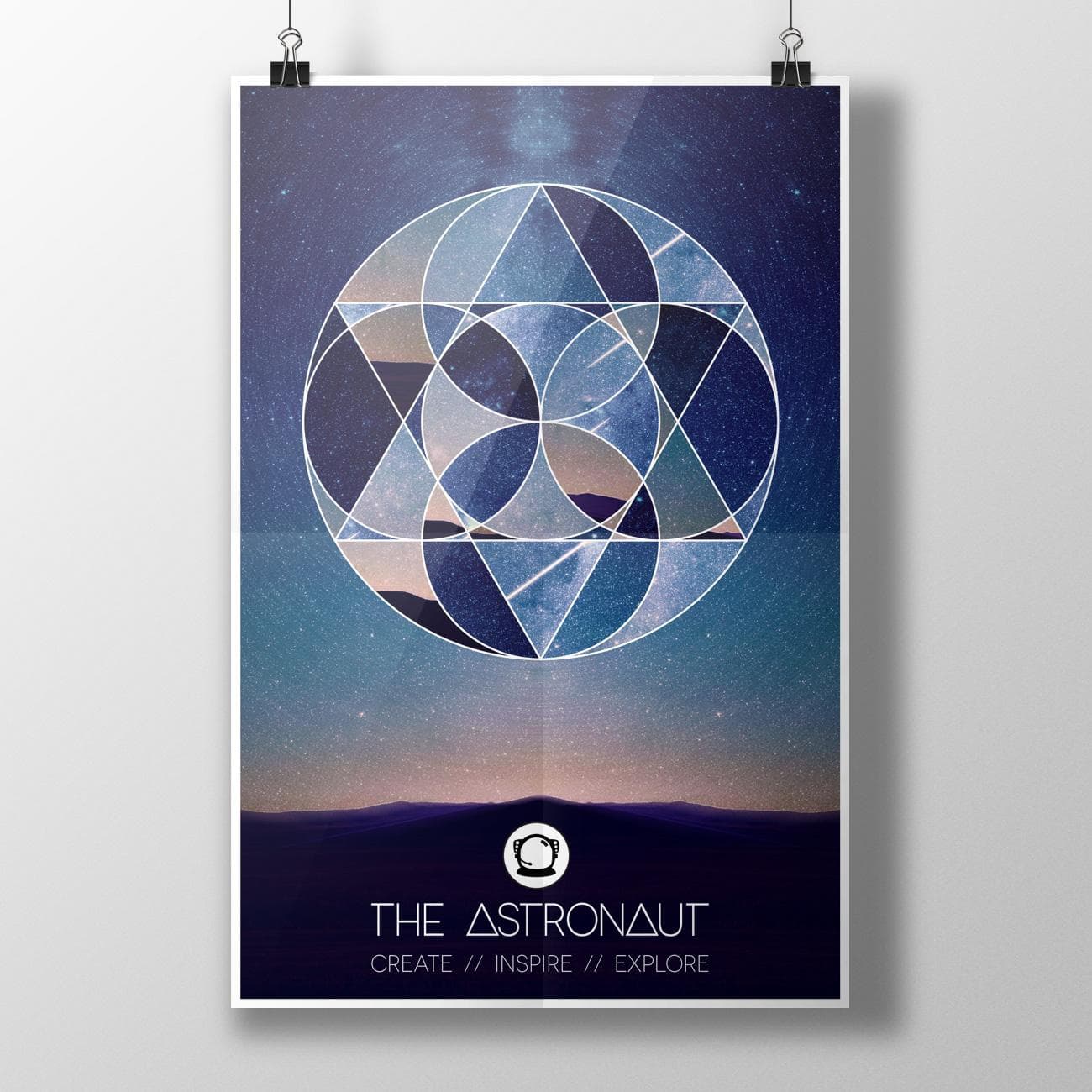
I actually like the poster mockup so much that I ordered a print of the design, which now hangs up above my iMac at my desk.